Popular Destinations in London Map
Maps can be exciting. When we hear the word maps, we tend to think about those which we all used at school. Thanks to technology and creativity, we now have more interesting and, even, interactive type of maps used in different professional fields. In fact, things have evolved so much that we now have come up with the name data visualisation. Take a look at the example below.
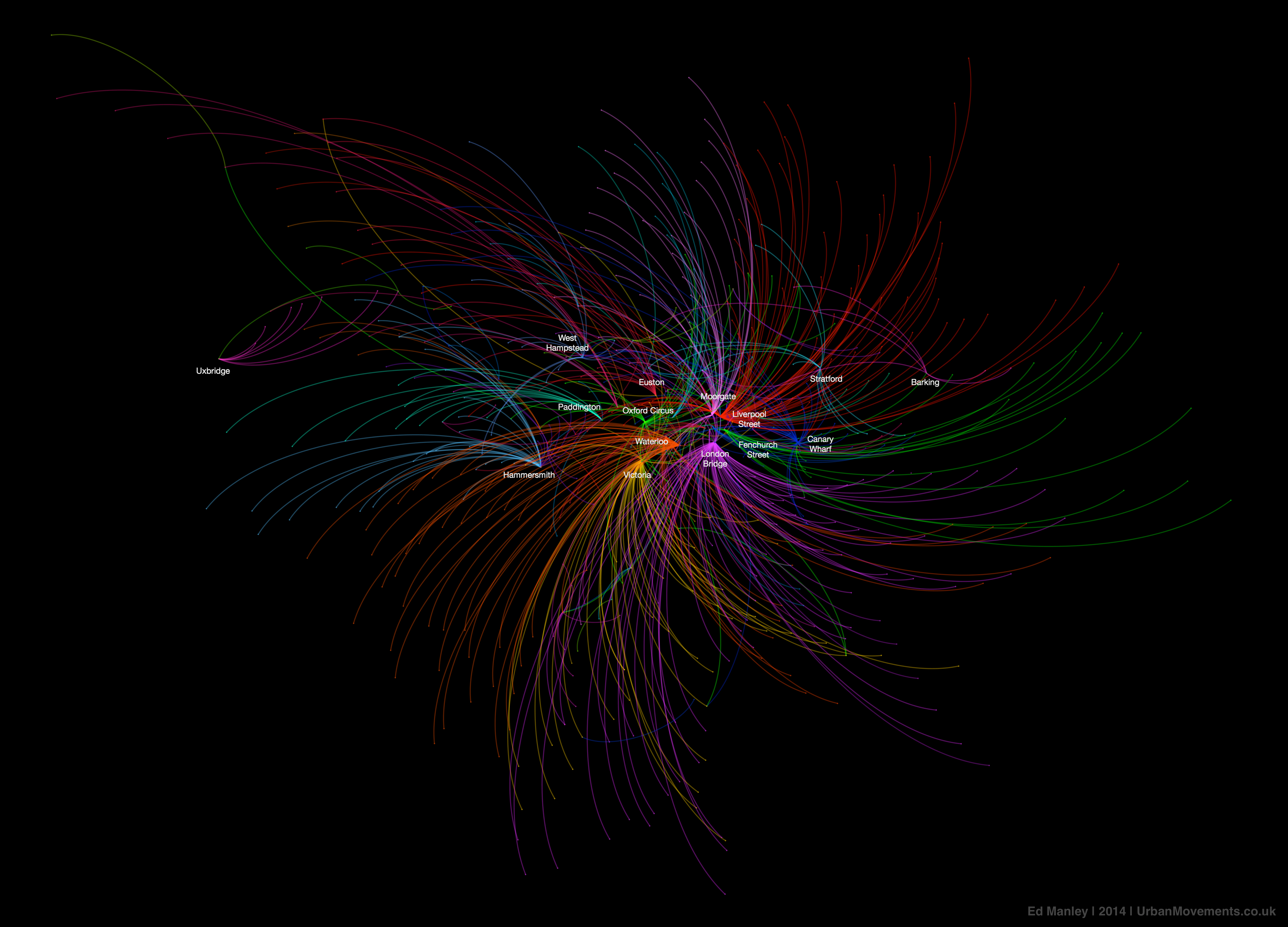
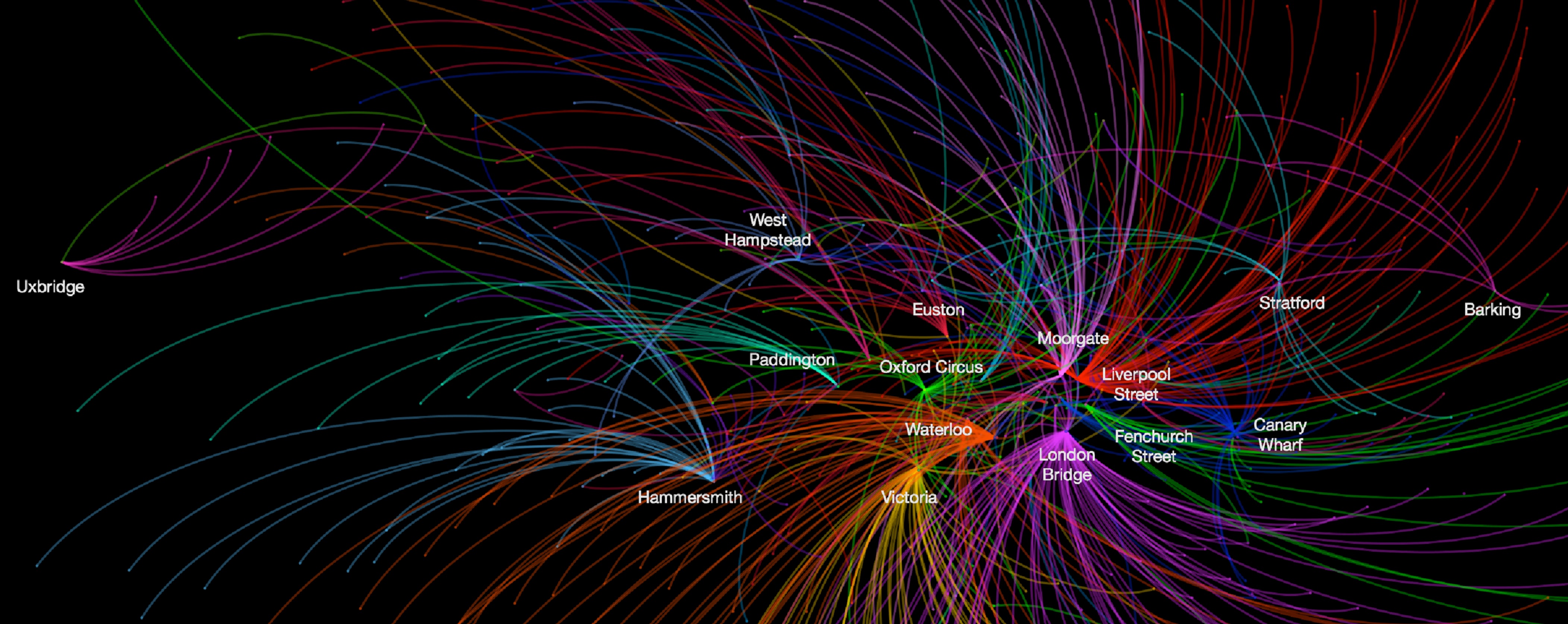
This is a great map showing the connections between all of London stations and their most popular destinations during three months in the summer of 2012 . The data used covers Oyster card transactions between 7am and 10am on weekdays. Bus trips are not covered. Ed Manley has used a dataset with 48.9 million journeys over 49 days, averaging at about 1 million trips per day. Now, that’s big.

Data visualisation is becoming more and more important nowadays, as it helps to understand big datasets more quickly and make better decisions. For instance, we can see that hugely important points in the public transport network such as King’s Cross are missing from the map, as it is not where many people actually ended their trips.

Thank you for reading this post.
A Londoner from Afar

This is pretty awesome and it reminds me of the Olympic Rings (obviously intentional given when it was done). Interesting about Kings Cross but if it’s not a destination, it not a destination!
Researchers and designers are doing awesome stuff with data visualisation. It can definitely help to understand data and so different from the usual charts!